We’ve been undergoing a bit of a makeover at the Old Strathcona Business Association! As we head in to the new year, we’re pleased to unveil a fresh, new look for our organization.
New website
Our previous website was a wealth of information, but was in definite need of an update. We knew we had some work to do in rebuilding a leaner, more modern site.
Our new website is much more responsive across all platforms, and is a big improvement in both appearance and usability. We’ve taken a bold approach with colour, and we’re loving the new, cleaner lines of the desktop and mobile versions.
This is a soft launch- we will be adding updates in phases starting in the new year. If there’s something in particular you’d love to see, please feel free to email us at info@oldstrathcona.ca.
New brand
With a website refresh on the horizon, we decided to take a closer look at our branding to truly reflect our community. While our previous brand had served us well, we felt that it was time to shake things up and find a look that really captured the current feel of our ‘hood.
So, we went back to the drawing board and thought about some things that represent our little pocket of the city. The area is changing – we’re a little more grown-up, a little more modern, and we’re preparing for a LOT of growth over the next few years. However, no matter how much things change and evolve, we also wanted to capture the historic ties and eclectic vibe that will always be an integral part of this neighbourhood.
It’s always a challenge when old meets new, but we think we’ve captured both the historic aspects of our ‘hood and kept things clean, modern and timeless with a new crest logo.
We went from this:

To this:

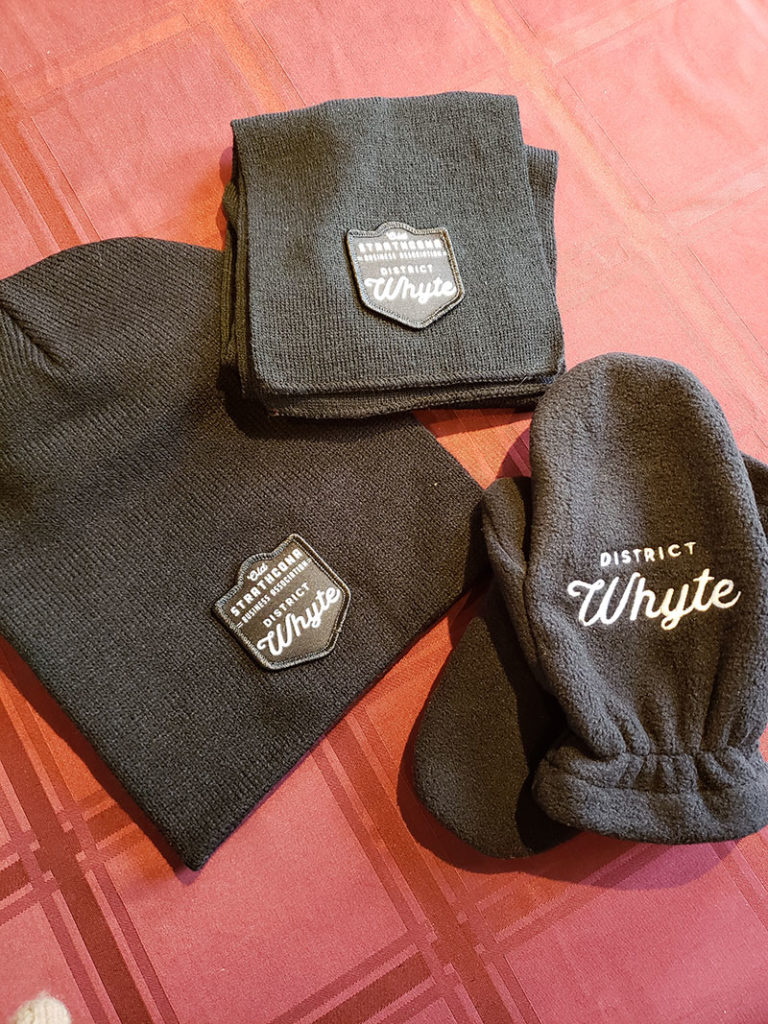
We’re so excited to move forward with this bold new logo – we feel that it perfectly captures the changing face of our ‘hood but still keeps a sense of history and nostalgia. Plus, it looks great on all of our swag. Check out our new winter gear!

